Overview
Holiday season after holiday season, I kept encountering poor coordination and experiences when gift-giving. I figured there had to be better way to coordinate on something as simple as gift-giving within a family, but failed to find a solution. I accepted that gift-giving coordination presents a significant user experience challenge and any tool to solve those difficulties would need to be built from scratch.
This case study explores the design of a solution that streamlines the gift-giving process through thoughtful UX design and centralized wishlist management. The goal: to create an intuitive platform that makes gifting coordination seamless for users of all technical abilities.
Research
The research phase began with gathering insights from my own personal experiences with gift-giving coordination. To validate these initial observations, I conducted a series of 1-on-1 interviews with personal family members across different age groups and technical abilities.
My research revealed that a solution shouldn’t be complex in its functionality, and it could borrow functionality from existing online registries and wishlists. Additionally, a key finding was the importance of designing for accessibility and ease of use.
Pain points
Through personal experience and user research, I identified several key pain points in the current gift-buying process:
- Lack of centralization: No single source of truth exists for managing wishlists and tracking purchased items.
- Platform limitations: Current registry solutions restrict users to specific retailers.
- Double-purchasing: Without real-time purchase tracking, people sometimes buy the same gift.
User personas
User personas can be effective or ineffective depending on a project's background and objective(s). I created just two personas to capture the core user types for this application, since there was a clear distinction between potential users.
Cautious tech user
The family member who isn’t particularly tech-savvy and prefers to keep track of information via physical means. They have varying device types and can navigate through a device’s interface with few issues.
Needs:
- Easily know what family members want
- Keep track of what they already purchased
Pain Points:
- Limited comfort with technology
- Frustrated by complex interfaces
Digital native
The family member who is more comfortable with technology. They can quickly navigate through a device’s interface regardless of whether it is a computer, tablet, or phone.
Goals:
- Keep gift purchases a surprise
Needs:
- Share links to exact items with information on an item’s style
Pain Points:
- Frustrated by scattered communication channels
- Tired of manually tracking who is buying what
General findings
Based on the technology literacy of potential users, I chose to focus on mobile-friendly web designs rather than a native mobile app. This approach reduces friction for users who are less comfortable with technology while making the experience consistent across devices.
Accessibility emerged as a prominent requirement for family members with differing disabilities and needs. This requirement led me to design a simple interface that minimizes complexity and guides users through the application seamlessly.
Following research, the structure of the app and its entities were finalized. To maintain simplicity for ease of use, the app’s essential components were limited. The app consists of:
- Items, something a user wants from any retailer or non-retailer (more on this later)
- Lists, containers for items that act as a wishlist
- Occasions, a container that holds one or many lists and is the vehicle to share lists with others
- Users, for the usual reasons and to connect with other users
- Families, a container for multiple users that makes it easier to invite users to an occasion
- Notifications, to share occasion invites and friend/family requests
Design Process
I began with low-fidelity wireframes using paper and pencil. The more screens I penciled in, the more I considered the choices made on previous screens. I found myself shifting focus between screens to make adjustments based on dependencies and previous decisions. The value of fleshing out underlying questions and requirements via low-fidelity designs is incomparable.
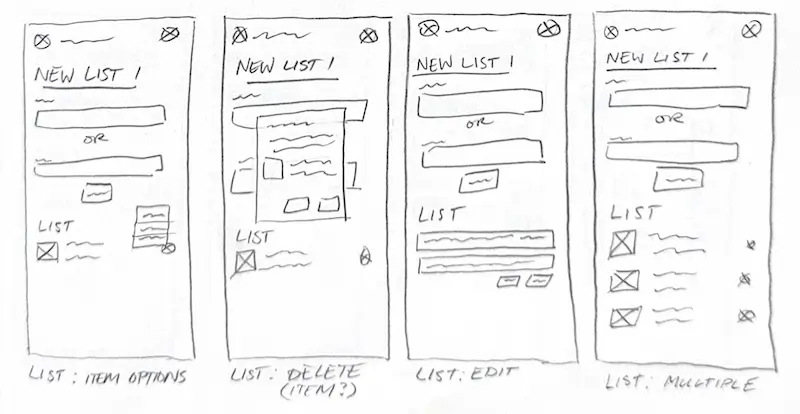
Low fidelity wireframes for lists
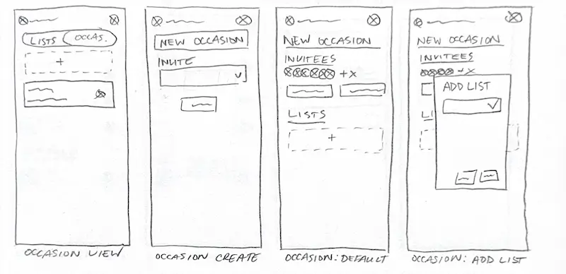
Low fidelity wireframes for occasions
The low-fidelity designs evolved into mid-fidelity designs in Figma, allowing for greater detail and refinement. This transition allowed for a deeper understanding of the application as I implemented requirements and addressed questions that surfaced during the low-fidelity phase. I grew increasingly confident in the app's direction, while still considering the pain points and accessibility needs identified during my research.
A few notes and questions that came to mind during this phase:
- Need many lists
- Share with family and friends
- Can someone view and edit without an account?
- Pricing for items? Is there an API?
- No modification of items after added to list
- List creator can’t see who claimed
- Mark as ready?
As I delved further into the mid-fidelity stage, the more I was tempted to start immediately on high-fidelity designs. I urged myself to stick with mid-fidelity until I solidified the core user experiences within the app. I focused my efforts on experiences of the most frequently used features of the app, lists and occasions.
After flows and user experiences were finalized, I progressed to high-fidelity designs. During this phase, the interface had undergone significant changes. Most changes were to grow the seedling ideas I started in the mid-fidelity phase into their final versions.
One example of this growth is the Family page where users manage their families. The mid-fidelity designs had options to join or create a family. Joining required a code that the family owner would need to provide. The simple code — a string of 8 characters — wouldn’t be as sustainable as the user base grew and the number of families increased. Additionally, safeguards would be required to prevent an unauthorized user from joining a valid family by simply entering a random code. While designing high-fidelity, the experience to join a family was modified to follow an invitation pattern common in most co-working apps. Despite the novel concept of using codes to control sharing, more traditional methods resolve the need to worry about sustainability and privacy.
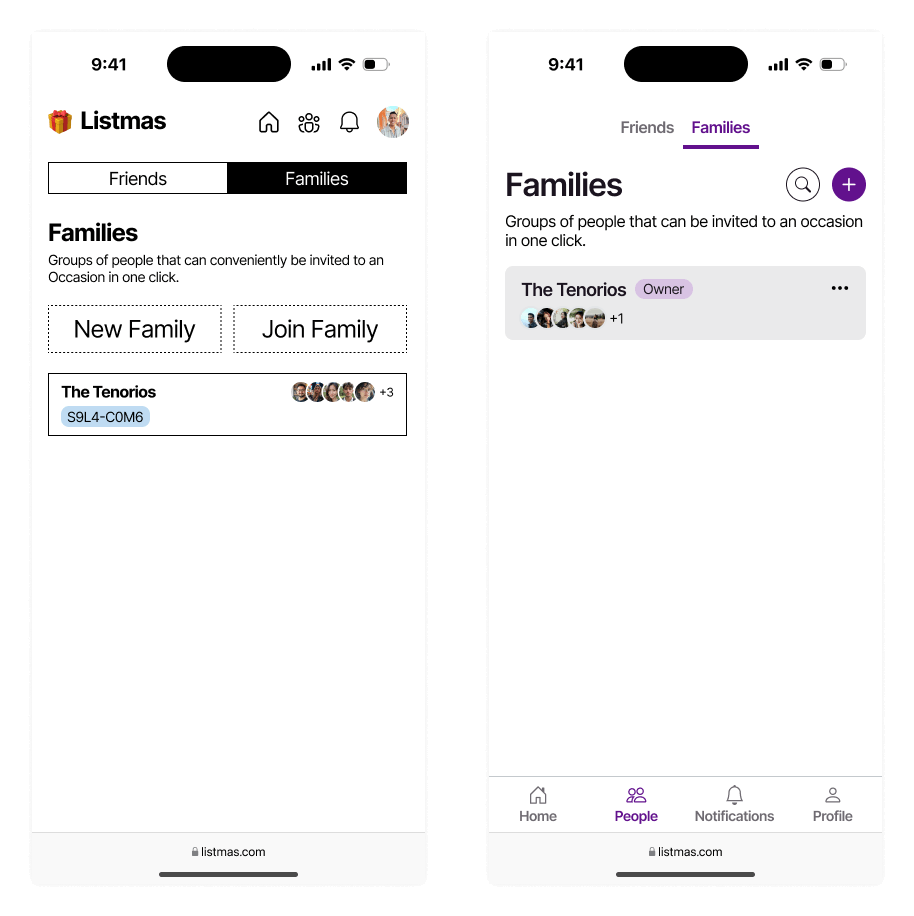
Mid and high fidelity family overview comparison
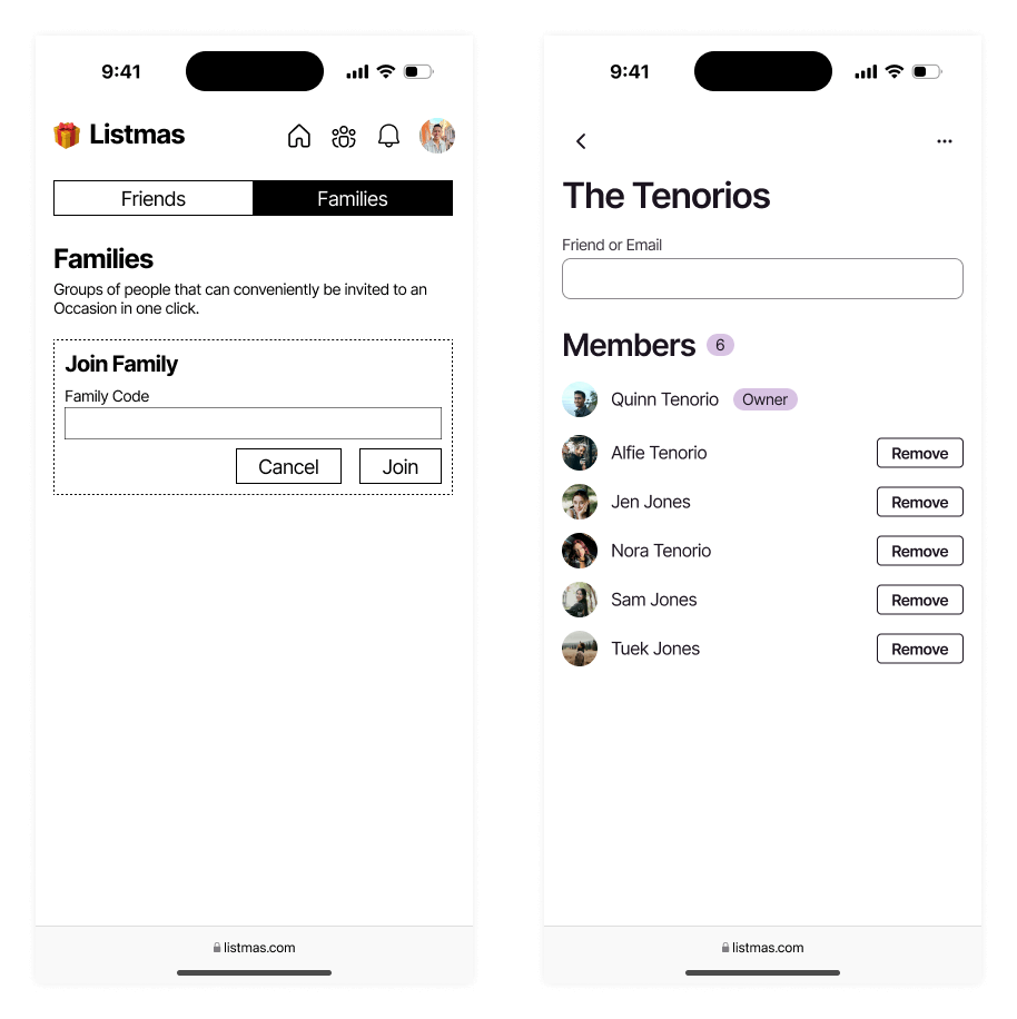
Mid and high fidelity family invite comparison
Another significant change was improving the process and interface of item claiming. In mid-fidelity, the interface was cluttered when a user viewed the list of another user. Additionally, the experience to claim an item via that interface was complicated by utilizing a select field and tiny information. Through refinement in high-fidelity design, a toggle pattern was implemented to make item claiming clearer and easier. The changes also had the intended effect of increasing item container height in the viewport, which reduced crowding in the list and the feeling of being overwhelmed.
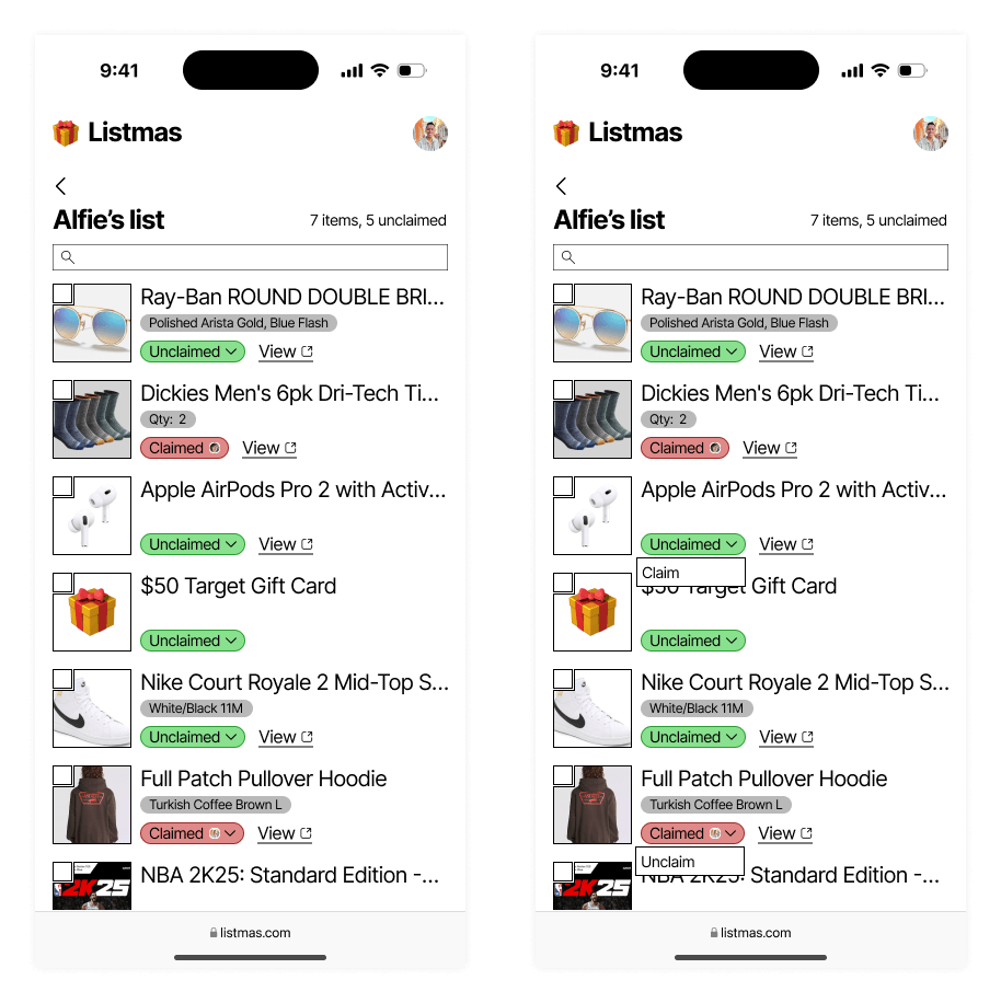
Mid-fidelity designs for claiming items
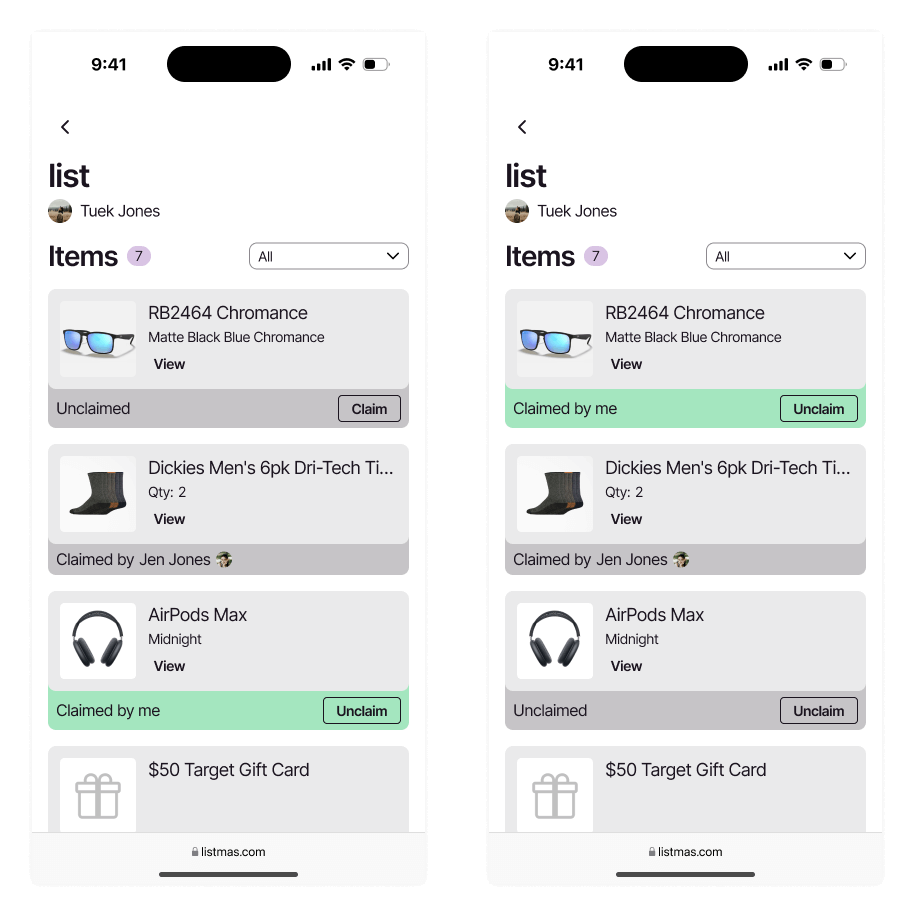
High-fidelity designs for claiming items
High-fidelity designs were reviewed with another UI/UX designer to gather input and feedback. Feedback included proposed features and questions, which shed some light on functionality (or lack thereof). Despite exceptional feature ideas from the other designer and myself, I chose to limit proposed features. The decision would (1) keep the project contained to a minimum viable product, and (2) provide additional time to consider the complexity of those features within the broader application. Care and caution went into designing a simple and accessible product, and adding more to it could muddy the functionality of the app.
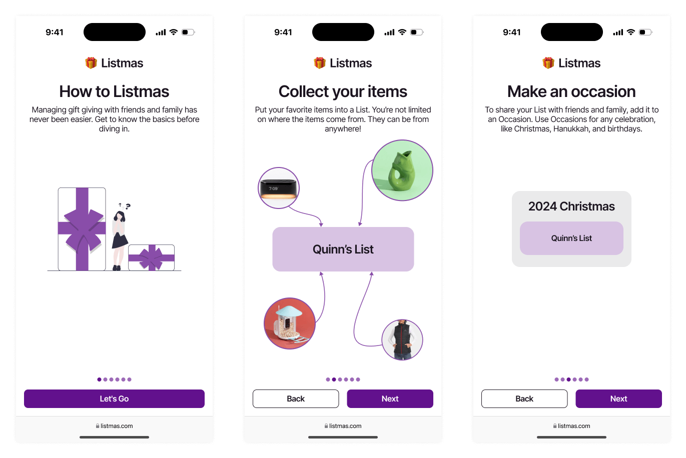
High-fidelity onboarding screens for steps 1 to 3
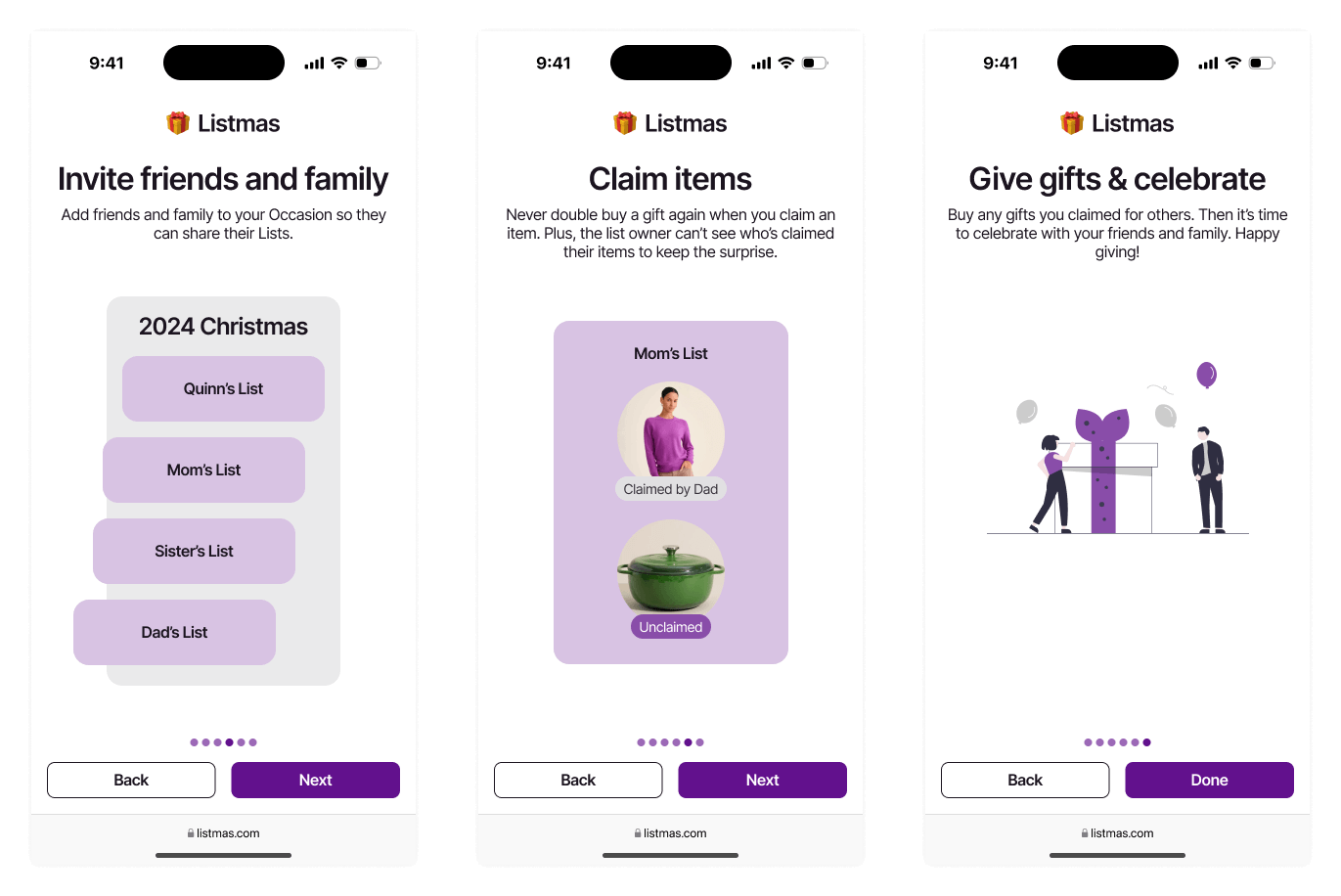
High-fidelity onboarding screens for steps 4 to 6
Conclusions
There are no solid plans on the books to build this out into a usable piece of software. I am considering a working frontend prototype to complete user tests and evaluate my current designs thus far. The primary purpose of this project was to realize this concept brewing in my head while showcasing my design process.
One aspect of this project I appreciated was the importance of low/mid-fidelity designs. I moved quickly when putting them together, and in doing so, I made decisions which proved to be the wrong path later on as I explored high-fidelity designs. The quick design phases also kept me on my toes and revealed the dependencies in my app. Exploring dependencies and issues early on prevented headaches in the later phase as the app become more robust.
I’m excited to continue designing new features in this app while still maintaining it’s simplicity and accessibility. Keep an eye out for updates as I progress on the future of Listmas.